Table of Contents
Design has been a part of human culture from the dawn of time. We have used and continue to utilize design to express vital messages from the time of stone tablets to the technological gadgets we use today. Every piece of our design should contribute to enhancing our users’ experience and more clearly communicating our message.
We’ll learn about Visual Hierarchy in UX Design and how we can utilize it to better our products and improve our consumers’ experiences in this post.
What is visual hierarchy?
Visual Hierarchy is a technique for ranking design components and influencing the order in which you want your users to see them. You may help establish each piece in its proper location and make the most essential aspects stand out by applying concepts like contrast, size, balance, and more.
What is the significance of visual hierarchy in UX design?
In order to make it simpler for your consumers to navigate through your product, the visual hierarchy may play an important part in the development of your information architecture. This can significantly minimize the time and effort required to interact with your product. Paying attention to visual hierarchy is a vital approach to remove friction and improve usability in a product, which is what UX design is all about.
Let’s take a look at some of these concepts and how they might affect how your material is navigated.
1. Reading patterns
Most civilizations read from left to right, but all cultures read from top to bottom. While that information is useful for page design, designers are aware that the work is far more difficult.
According to recent research, people skim a page to see whether it piques their attention before committing to reading it. Scanning patterns often take one of two forms, “F” or “Z,” which you may use in your design.
F-PATTERNS
F-patterns are used on text-heavy sites like articles and blog entries. When a reader comes across anything fascinating, he or she scans along the left side of the page, seeking relevant keywords in left-aligned headers or opening subject phrases, then stops and reads (to the right). The end product resembles an F (or an E, or anything with even more horizontal bars; but the word “F” has remained).
What can you do with this? Use brief, bolded headers, bullet points, and other attention-grabbers to break up paragraph blocks and align crucial information to the left.
Z-PATTERNS
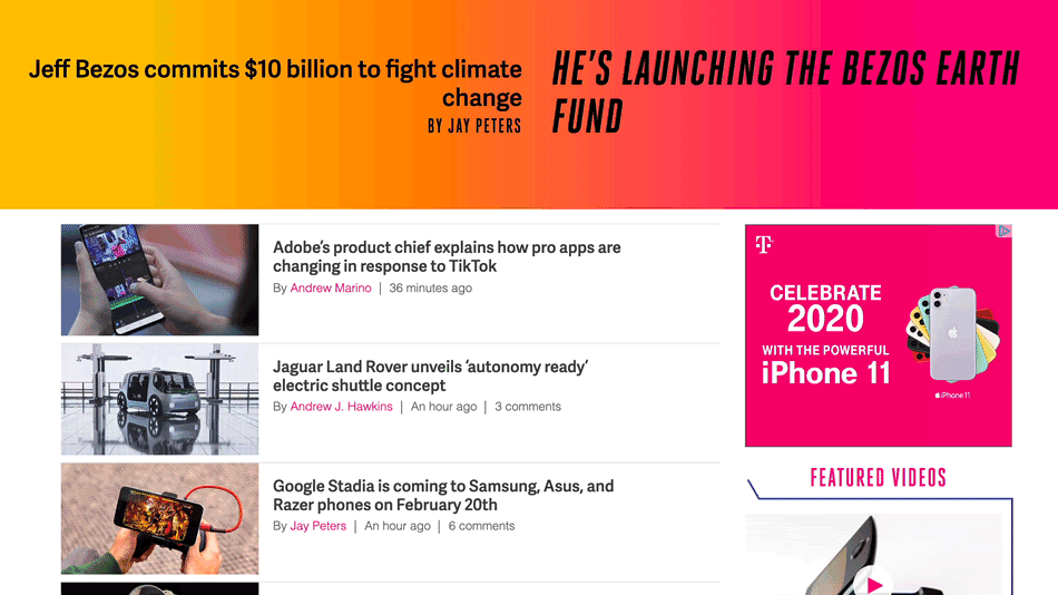
Z-patterns can be used on various types of pages, such as advertisements or websites, where the material isn’t always presented in block paragraphs. A reader’s eye scans over the top of the page, where vital information is most likely to be located, then shoots diagonally down to the opposite corner and does the same thing across the bottom of the page.
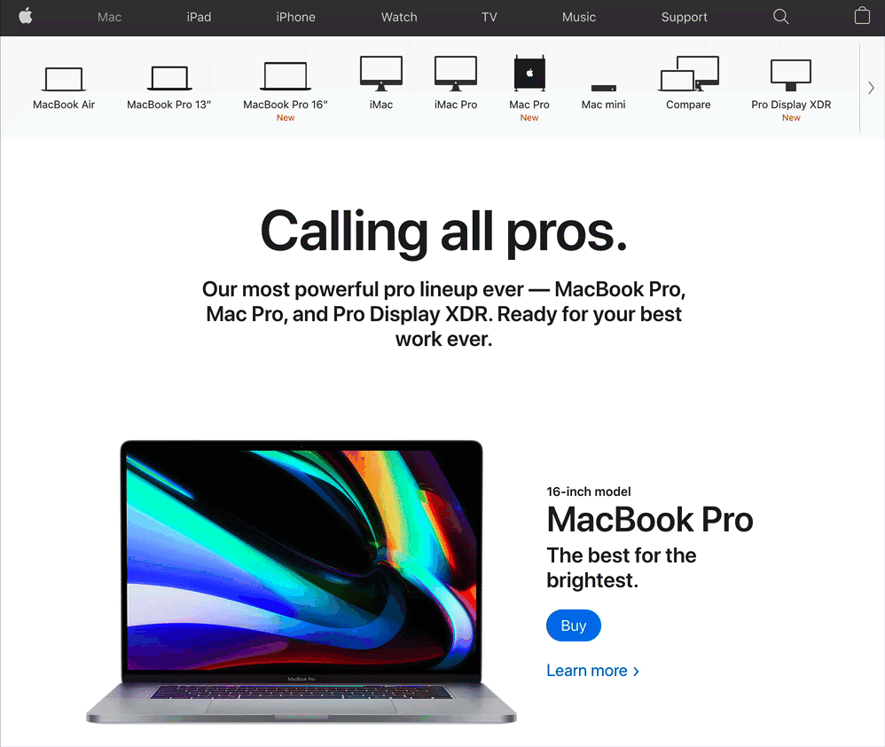
The most significant content is often placed in the corners of web pages, with other key information-oriented along the top and bottom bars and connecting diagonal.
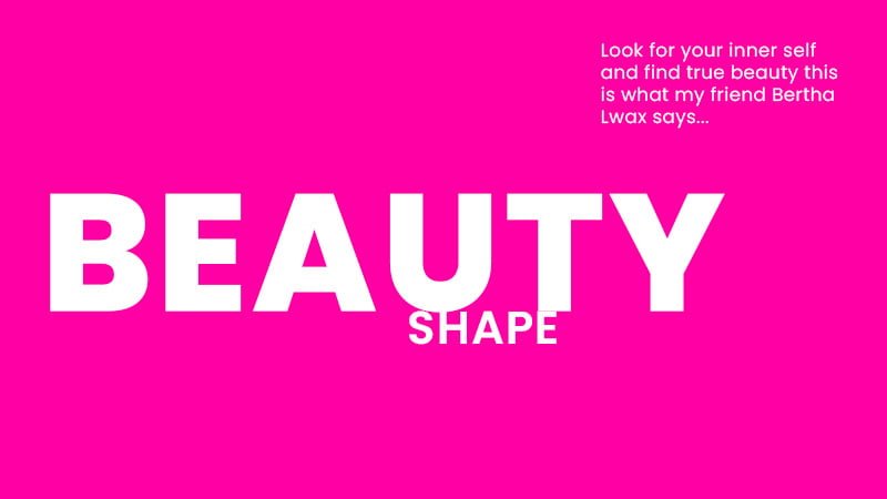
2. Using size and scale to pull focus
Sizing is a simple yet important idea that may assist focus the viewer’s interest in a certain region and give items more prominence than others. You may instantly catch the viewer’s attention by raising the magnitude of an element. However, you must be careful not to enlarge too many components or raise the size in such a manner that other items on the screen lose prominence.
Notice in the example illustration below where your eye is drawn to the word “beauty” first then “shape”
3. Spacing and texture
Giving material plenty of breathing room is another technique to get people’s attention. These features will be more noticeable to readers if there is significant negative space surrounding a button or the lines in a text block are widely spaced.
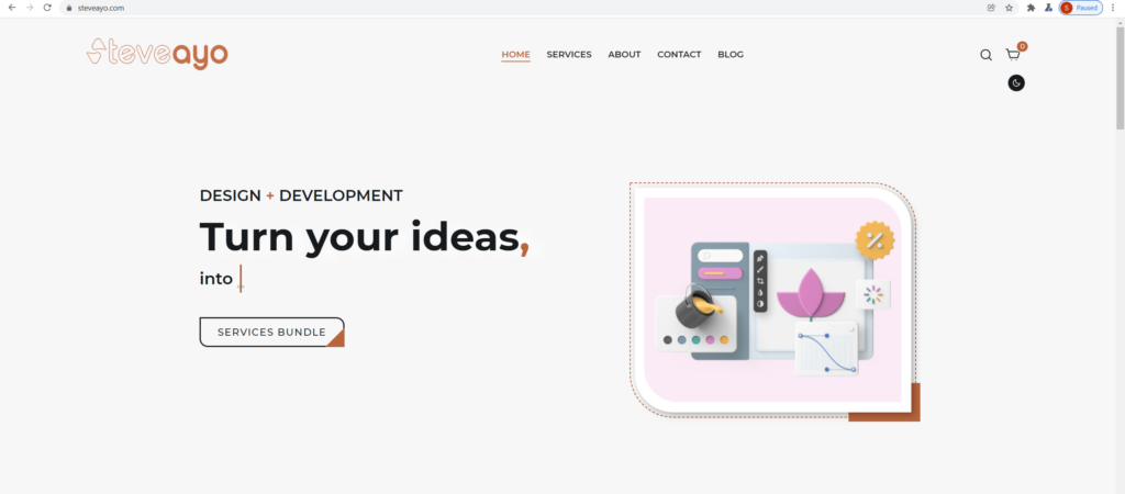
On SteveAyo’s website below, you’ll notice the spacing around the text on the left and all other elements around it. This use of whitespace groups the text and call to action together while still providing nice spatial balance to the overall design.
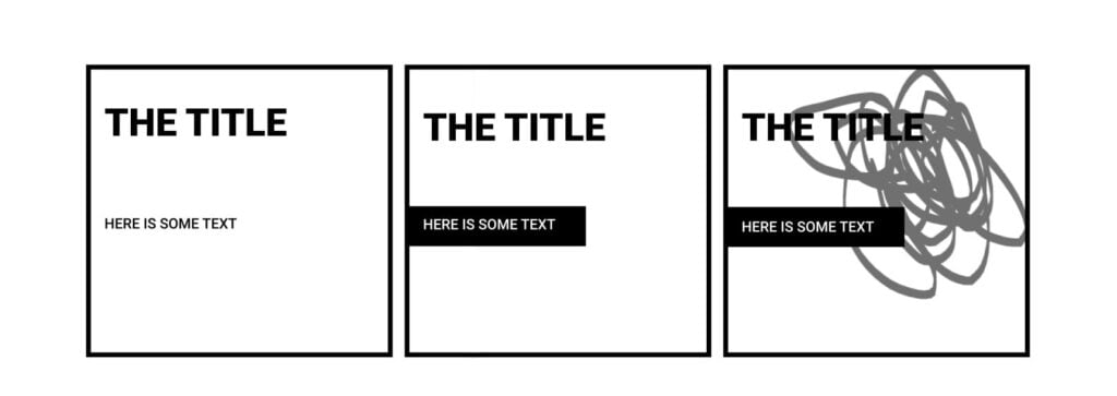
When people You can use texture and tone to direct the viewer’s attention, even if some elements might be smaller or lower than other elements on the screen.
In the first example below you’ll notice the title text first; but in example 2, when we change the tone of the text below, the two lines of text appear more balanced. In the last example, the scribble in the background conflicts with the title, making it hard to read or recognize. This makes the text below stand out much more prominently.
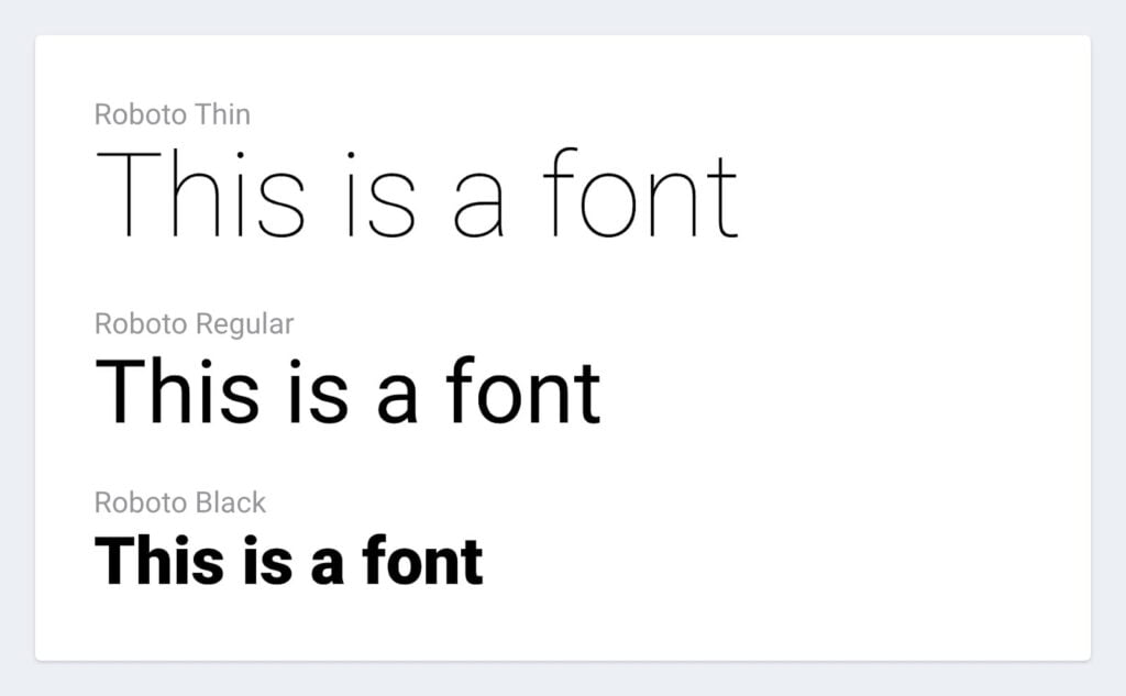
4. Typeface weight and pairing
The appropriate typeface combination may offer your website individuality and draw attention to specific sections. Different sizes and weights of typefaces can also be utilized to create a hierarchy and highlight more essential text parts.
Most websites are intended to employ various sizes of headers to emphasize or bring attention to the material connected with them. It’s best to utilize heading 1 (H1) as the page’s largest and most significant headline, then heading 2 (H2), 3 (H3), and so on to bring attention to less important regions. This also aids readers in skimming through pages of material to find the exact location that interests them.
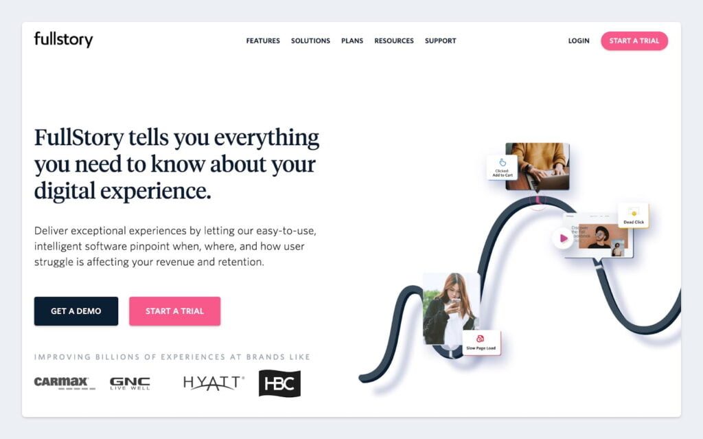
5. Color and tint
Another no-brainer: bright colors stand out against muted or grayscale tones, while lighter tints seem more “remote” and hence rank lower than richer, deeper tones.
Colors can be used similarly to size and weight to give importance to elements in your design. Brighter colors are typically going to grab the viewer’s attention much more than dull, non-saturated colors.
You’ll see a main high contrasting hue on buttons that serve as the most important call to action in the sample below, as well as most website navigation. You may provide consumers a more pleasant experience and enhance conversions in your targeted flow by assisting them in understanding where you want them to go.
6. Proximity of elements
Placing elements closer together can give the reader the perception that they are related, which will give them the incentive to read on or engage further.
It’s tough for your eyes to scan the material in the example below before the pieces come closer to each other. Because the summary text isn’t exactly below the title, you may be less motivated to follow through; yet, by rearranging these pieces, skimming the material becomes much easier, boosting the likelihood of better visitor engagement.
To Conclude.
We’ve gone over many different principles and examples of visual hierarchy for UX design. They might all make sense now, but could be more confusing to put into practice. The more elements you deem “most important,” the harder it will be to perfect your design. Start simple and focus on that one thing of biggest importance.


UI/UX is the basis for any successful conversion optimization plan. If you want to build websites that actually make money, you have to understand what makes a good user experience. This has opened the path for me to take the next step.
Thank you for sharing your thoughts! Indeed, UI/UX plays a key role in driving a successful conversion optimization strategies. Wishing you luck on your upcoming project!