Table of Contents
Grids are the unseen glue that holds a design together. Here’s everything you need to know about it.
Grid theory is important to know whether you work in web or print design. While some designers consciously avoid grids in favor of a more natural, freeform style, the most successful designers do so after years of experience with grids — they know the laws before breaking them.
1. Grids establish a meter and rhythm
A grid’s primary function – at least in graphic design – is to define a set of principles for how objects should be placed inside a layout. An effective grid not only establishes the rhythm of a design, but it also establishes the meter.
This is a crucial aspect of making the content accessible and assisting the user in determining where the next piece of information in the layout may be found. It establishes expectations and establishes the design’s rules, timbre, and – in some situations – voice. Consider a grid to be the road map that your viewers will follow.
2. Grids define and reflect proportion
The grid’s ability to assist assess and defining proportion is an important feature. In print, proportions frequently reflect the size of the media; for example, the size and form of images contained within a layout are frequently reflected in the shape and orientation of the paper.
Because of the actual shape and size of the delivery mechanism, such as a sheet of paper, the reader subliminally understands the context of the layout, this feels comfortable.
On the web, the concept of reflection is less essential, but grids can be used to tie material back to the screen in the same way. Screens can be more fluid, and as a designer, you can’t be sure what size and shape of the screen will be utilized to see material with the same certainty.
Regardless, proportion and scale are crucial tools in a layout, and utilizing a grid to define and enforce standards aids in defining that all-important set of signposts that allow the reader to access and interpret the material.
3. Grids work with the Golden Ratio
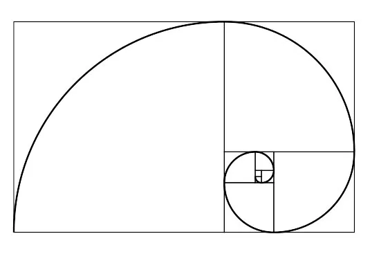
In the field of design, the concept of a definitive grid system is a relatively new invention. Grids have existed intuitively since the dawn of drawing and writing, but the layout has only lately been studied in-depth, and as a result, it has never existed in isolation from other best-practice layout standards. Where the Golden Ratio meets the grid is an example of a crossover.
The Golden Ratio (also known as the golden mean) finds the most appealing combination of proportions for an element and can be summed up as the ‘rule of thirds.’ These fundamental guidelines for size, location, and proportion, when applied in conjunction with a grid, can assist ensure that a layout feels both coherent and visually pleasing.
This is significant because, once again, it can aid in the accessibility of the content. Remember that a grid is an invisible glue that holds the information together; it should, in most situations, be invisible to the viewer.
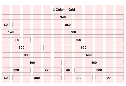
4. There’s a 960 grid system on the web
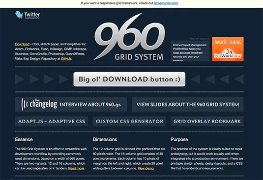
Given the advantages of using a grid system, it’s no surprise that web designers have embraced grids. A few common sizes have become the standard to make things more feasible. The 960px grid system is the most frequent.
960px is a nice size since it can be divided into several factors: 1, 2, 3, 4, 5, 6, 8, 10, 12, 15, 16, 20, 24, 30, 32, 40, 48, 60, 64, 80, 96, 120, 160, and so on. The ability to divide the grid in this way allows for a lot of flexibility in column width, resulting in a multi-purpose, reusable grid system.
Needless to say, a slew of designers have been hard at work turning the 960px grid into a set of useful CSS frameworks. 960.gs is one such example, but there are others accessible as well.
5. Grids provide a solid foundation
Grids, as we’ve seen, are generally used to aid in the placement and balance of elements in a layout. This type of solid foundation can assist guarantee that content is presented in a logical order, but it can also be utilized to highlight specific parts of content by breaking them out of the grid.
These break-outs will automatically grab the viewer’s attention, allowing the designer to experiment with the hierarchy of a layout and change the meaning of a piece of work.
6. Grids work with other key design principles
Remember that the grid is simply one of many basic concepts that you may utilize to improve your layouts. Don’t get too hung up on the grid – some of the best designs defy all the laws of grid layout and are all the more successful as a result.
Experiencing how and when to utilize a grid is the only way to truly understand it, so try it out. Other useful tools and principles for improving your designs can be found in our other articles on design theory below.


Add your first comment to this post