
Table of Contents
Getting started in logo design? Here’s everything to know before setting out on a brand identity project.
Did you know you can excel in the graphic design without a college degree?
It might be difficult to know where to begin with the massive task of developing a logo, so, in order to simplify matters, we’ve compiled a list of 10 logo design golden standards. This helpful collection of logo design hints will cover both the design process and how to incorporate your logo into a larger brand plan.
The right logo is aligned with the right product can eventually become a priceless asset. To give your own logo the best chance of success, bear in mind the universal traits shared by every successful logo design.
Why is logo design important?
Logos are significant because they are frequently the first piece of branding that a potential consumer encounters. A logo may reveal a lot about a company, including what it stands for (in certain cases). Consumers are more likely to commit their time or money to a firm if they connect with the logo design.
Most designers can create a decent logo but it takes a special mix of design and application skills to master the art of logo design. Take a look at our selection of some of the best examples from the industry’s top designers.
The golden rules of logo design
There are hundreds, if not thousands, of different brands vying for our attention. This implies that brands must visibly distinguish themselves in order to prevent being mistaken. Differentiation is done through brand identity design, which consists of a collection of features that work together to create a distinct mental image of the company. Uniforms, vehicle graphics, business cards, product packaging, billboard advertising, coffee mugs, and other collaterals, as well as photography style and typeface selection, are all examples of brand identity design.
When you think about someone who has had a significant influence on your life, you undoubtedly have a mental image of them. The same may be said about brands. A logo serves as the face of a company, helping customers to recognize it and remember it. As a result, the goal of logo design should be to produce something that people can see when they think about their encounters with a product, company, or service.
It’s important to remember that we perceive shape and color before we read when we look at anything. We only begin to read if that is sufficient to keep our interest. Designers’ duty is to instill the spirit of a brand into the shape and color that will last the longest. To assist you in doing so, David Airey has provided his 10 golden guidelines of logo design below.
01. Lay the foundation

Starting a logo design project with some foundation is a good idea. It will also be simpler to get an agreement on your logo if you get to know the customer and their product well. Every customer is unique, and even within the same profession, people do their duties in a variety of ways.
Make certain to inquire as to why your client exists. What exactly do they do, and how do they go about doing it? What distinguishes them from other brands? What do they value the most and why are they there?
Some of these questions may appear to be redundant since they are so simple, but they can be difficult to answer and can lead to further inquiries about your clients’ company. What you learn during the discovery phase of a logo design project can aid you in selecting the strongest design direction and ensuring that you don’t miss the target.
02. Value your sketchpad
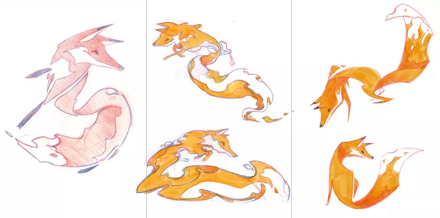
With so many digital tools accessible today, you might be tempted to leap immediately to a computer for logo creation, but utilizing a sketchpad allows you to take a break from the glare of brightly illuminated pixels while also allowing you to record design ideas much more rapidly and freely. You have total freedom to explore because there is no computer interface in the way, and if you wake up in the middle of the night with an idea you don’t want to forget, a pen and paper by your bed is still the best method to write it down.
Sketching makes it easier to put shapes exactly where you want them, and there will always be time to digitize your marks later. It can also be useful to share some sketches when you’re describing design ideas to clients.
03. Begin with black and white.
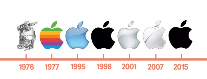
As previously said, color may be a distraction and make it tough for a customer to grasp the logo’s essential notion. By deferring color until later in the process, you may concentrate on the concept of your logo design rather than an aspect that is typically much simpler to adjust.
It’s hard to save a bad concept with a fun color scheme, but a good idea will always be wonderful regardless of color. The most crucial aspects are the lines, forms, and the concept itself. If you’re thinking of a well-known sign, consider the form first, then the palette.
04. Keep it appropriate
A logo design must be appropriate for the concepts, ideas, and activities it symbolizes. A high-end restaurant will benefit from attractive typography more than a children’s daycare. A color scheme of brilliant pink and yellow, on the other hand, is unlikely to engage male retirees. And, regardless of business, creating a mark that looks like a swastika isn’t going to succeed.
The more suitable your explanation for a design, the simpler it will be to persuade a customer to accept it. Keep in mind that designers do more than simply design. They also sell, which for a first-time designer might be the most difficult aspect of the job.
05. Aim for easy recall

Simplicity helps with recognition, which may be a big winning point when there are so many businesses vying for attention. A basic logo may frequently be remembered after only a few seconds of seeing, which is impossible with a highly complex design.
A trademark must be centered on a single story or concept. In most situations, this implies it should have a simple design that can be used in a variety of sizes and applications, ranging from a website icon in a browser bar to building signage.
06. Make an effort to stand out

If all of a company’s rivals are utilizing the same typographic style, color palette, or symbol to the left of the brand name, this is the ideal time to differentiate your client rather than blend in. Adding a unique twist to your logo design might make it stand out.
Because there is so much commonality in the marketplace, it doesn’t imply your work will be any easier. Showing inventiveness in your portfolio, on the other hand, is a smart method to attract the type of customer you desire.
07. Think about your brand’s overall identity
Relevant touchpoints should be included in a client presentation to demonstrate how the logo appears when seen by potential customers. Normally, we don’t see a logo on its whole. Taking a step back and looking at the broad picture might help you realize where you are and what you’re up against.
The wider picture in terms of design is every possible object on which your logo design may appear. Always consider how the identity functions without the logo. While significant, a symbol can only carry a person’s identity so far. Crafting a unique typeface for your brand is one approach to generating consistent looks. After then, the typeface can be utilized in marketing headlines.
08. Don’t take things too literally

It’s not necessary for a logo design to depict what a firm does; in fact, it’s generally preferable if it doesn’t. Marks that are more abstract are frequently more durable. Historically, you’d display your factory or, if it was a family-run firm, a heraldic crest, but symbols don’t convey what you do instead they make it plain who you are. When correlations can be made between what the firm does and the shape and color of its mark, the mark’s meaning in the eyes of the public is added afterward.
09. Remember symbols aren’t essential
A symbol isn’t necessarily required in a logo. A customized wordmark may often be effective, particularly when the company name is distinctive – see Google, Mobil, or Pirelli. Don’t be tempted to go overboard with the design flair simply because the letters are the focal point. With every wordmark, legibility is crucial, and your presentations should show how your designs operate at all sizes; large and tiny.
Of course, in extremely tiny applications, words may not function, therefore changes may be required. This might be as easy as copying a letter from the logomark and using the same color, or it could include including a symbol that can be used as a secondary design element (wordmark first, symbol second) rather than a logo lockup in which all components are displayed together.
10. Make people smile

Adding a little wit to your logo design not only makes your job more enjoyable but may also help your customer succeed. It isn’t acceptable for every profession (for example, it isn’t appropriate for weapons makers or cigarette corporations, although whether you choose to work for them is another matter). Companies in the less controversial law and banking industries, on the other hand, are recognized by stuffy and antiseptic branding. Adding a dash of comedy to such customers’ personas can help them stand out.
It’s important to strike a balance. You risk offending potential clients if you take it too far. People conduct business with people, regardless of the organization, therefore having a human, emotional dimension to your job will always be relevant.
We have the right team for you that can bring your website to life and communicate your story. We are a team of designers, marketers, and technologists who work together in the areas of design, marketing, and technology. To learn more, Get in touch with us.


Add your first comment to this post