Table of Contents
In the world of web development and design, CSS (Cascading Style Sheets) plays a crucial role in creating visually appealing and interactive websites. When it comes to positioning elements on a webpage, developers often encounter the need to make certain elements stick to a specific position while scrolling. Traditionally, the
position: fixedproperty has been used for this purpose. However, there is a better alternative that offers more flexibility and improved user experience –position: sticky.
Why Choose position: sticky?
Better Flexibility
With the position: sticky property, you can create elements that behave as if they are positioned relatively until a specified offset threshold is reached during scrolling. At that point, the element becomes “sticky” and remains fixed in its position until the user scrolls past the sticky element.
Using position: sticky gives you the advantage of combining the best of both worlds: the flexibility of relative positioning and the fixed positioning behavior when needed. This makes it an ideal choice for elements like headers, navigation menus, sidebars, and other elements that need to remain visible while scrolling through content.
Improved User Experience
One of the main advantages of using position: sticky over position: fixed is the enhanced user experience it offers. When an element is set to position: fixed, it remains fixed in the viewport regardless of the content around it. This can often lead to overlapping and obstructing the view of other important elements on the page.
In contrast, position: sticky allows the element to flow naturally with the rest of the content until a certain scroll point is reached. This prevents the element from covering other content and ensures a seamless browsing experience for users.
How to Implement position: sticky
Implementing position: sticky is relatively straightforward. To create a sticky element, you need to follow these steps:
- Identify the element you want to make sticky.
- Set the CSS property
position: sticky;on the element. - Specify the offset threshold using the
top,bottom,left, orrightproperties.
Here’s an example of CSS code that makes a navigation menu sticky:
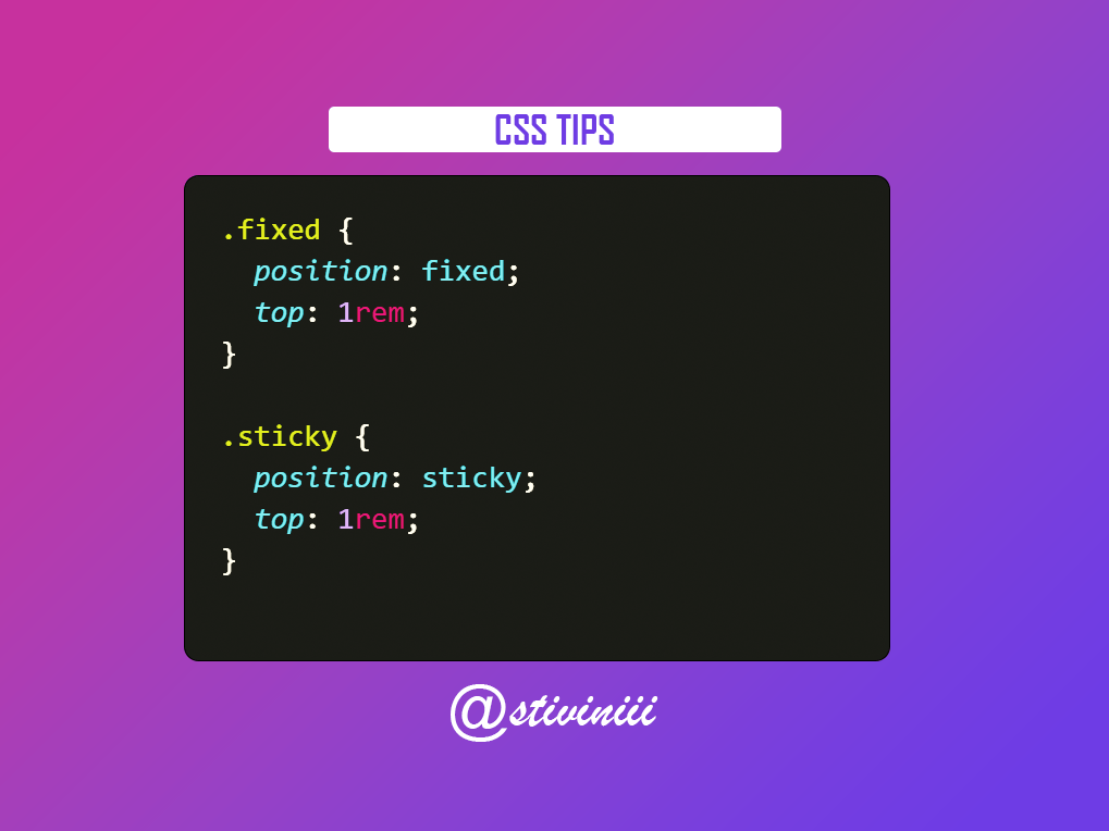
.nav {
  position: sticky;
  top: 0;
}
In this example, the .nav element will become sticky when the top of the viewport reaches its original position.
When position: fixed is a Better Option
While position: sticky offers many advantages over position: fixed, there are still certain scenarios where using position: fixed is a better option. Let’s explore some of these scenarios:
1. Persistent Element Placement
In some cases, you may want an element to remain fixed at a specific position on the screen, regardless of scrolling or other interactions. This is where position: fixed shines. Elements such as “back to top” buttons or persistent sidebars often benefit from position: fixed as they remain visible and easily accessible at all times.
.back-to-top {
  position: fixed;
  bottom: 20px;
  right: 20px;
}
In this example, the .back-to-top button will remain fixed at the bottom-right corner of the viewport, allowing users to easily navigate back to the top of the page regardless of scrolling.
2. Overlapping Elements
If you have overlapping elements on your webpage and you want one element to overlap the others, position: fixed is a suitable choice. Unlike position: sticky, position: fixed completely removes the element from the document flow and keeps it fixed relative to the viewport. This can be useful when creating overlays, modal windows, or tooltips.
.overlay {
  position: fixed;
  top: 0;
  left: 0;
  width: 100%;
  height: 100%;
  background-color: rgba(0, 0, 0, 0.5);
  z-index: 9999;
}

.tooltip {
  position: fixed;
  top: 50px;
  left: 50px;
}
In this example, the .overlay element covers the entire viewport with a semi-transparent background, while the .tooltip element remains fixed at a specific position, appearing above other elements.
3. Scrollable Containers
While position: sticky works well for elements within the main viewport, it may not provide the desired behavior within scrollable containers. If you have a container with a fixed height and scrollable content, using position: fixed for specific elements within that container ensures their visibility and fixed positioning even when the container is scrolled.
<div class="scrollable-container">
  <div class="sticky-element">
    <!-- Content here -->
  </div>
</div>
.scrollable-container {
  position: relative;
  height: 400px;
  overflow-y: scroll;
}

.sticky-element {
  position: fixed;
  top: 20px;
}
In this example, the .sticky-element remains fixed at a specific position within a scrollable container. As the container is scrolled, the element stays in place, providing persistent visibility within the scrollable area.
4. Browser Compatibility
Although position: sticky enjoys broad support among modern browsers, there may still be some older browsers or specific versions that do not fully support it. In such cases, using position: fixed provides a more reliable fallback option to ensure consistent behavior across different browsers.
When using position: fixed, it’s important to provide a fallback for browsers that do not support position: sticky. You can achieve this by using media queries and conditional CSS:
.sticky-element {
  position: fixed;
  top: 20px;
}

/* Fallback for browsers that do not support `position: sticky` */
@supports not (position: sticky) {
  .sticky-element {
    position: static;
  }
}
In this example, if the browser does not support position: sticky, the .sticky-element will default to position: static, ensuring that it remains visible although it won’t have the sticky behavior.
5. Creating Parallax Effects
Parallax scrolling effects, where elements move at different speeds while scrolling, are commonly achieved using position: fixed. By fixing certain elements in the background while others scroll normally, you can create captivating and immersive visual experiences.
<div class="parallax-container">
  <div class="background-element"></div>
  <div class="foreground-element">
    <!-- Content here -->
  </div>
</div>
.parallax-container {
  position: relative;
  height: 600px;
  overflow: hidden;
}

.background-element {
  position: fixed;
  top: 0;
  left: 0;
  width: 100%;
  height: 100%;
  background-image: url('background-image.jpg');
  background-size: cover;
  background-position: center;
  z-index: -1;
}

.foreground-element {
  position: relative;
  z-index: 1;
}
In this example, the .background-element remains fixed using position: fixed, creating a parallax effect as the .foreground-element scrolls normally within the .parallax-container.
Remember, the choice between position: sticky and position: fixed depends on the specific requirements of your design and the desired user experience. Understanding the strengths of each property will help you make an informed decision.
What browsers support position: sticky?
position: sticky is supported by most modern browsers, including Chrome, Firefox, Safari, and Edge. However, it is always a good practice to check browser compatibility before implementing it on a live website.
How can I specify the offset threshold for a sticky element?
You can specify the offset threshold by using the top, bottom, left, or right properties in combination with a length value (e.g., pixels, percentages, or auto). Experimenting with different values will help you achieve the desired effect.
Are there any performance considerations when using position: sticky?
While position: sticky is a powerful CSS property, it can impact performance, especially when applied to multiple elements on a page. Excessive use of sticky elements may lead to increased memory usage and slower scrolling, particularly on older devices.
Are there any accessibility considerations when using sticky elements?
When using sticky elements, it’s important to ensure that they don’t hinder accessibility. Make sure the sticky element does not cover or hide essential content, and that it remains usable for users with disabilities who rely on screen readers or assistive technologies.
In conclusion, when it comes to creating sticky elements on a webpage, position: sticky offers a better alternative to the traditional position: fixed property. Its flexibility, improved user experience, and easy implementation make it a valuable tool for web developers and designers.
By using position: sticky, you can enhance the interactivity and usability of your website, providing a seamless scrolling experience for your users. So, next time you need to make an element stick to a specific position, remember to choose position: sticky instead of position: fixed.


Add your first comment to this post