Table of Contents
Calls-to-action (CTAs) that are effective have a big impact on sales results. Users may choose not to fill out forms, click on advertisements, or subscribe to newsletters if a call to action is ineffective. Gaining success with your website requires that you become an expert at creating appealing call to action (CTAs).
Initiating such actions is critical to maintaining business growth.
Therefore, you must create appealing calls to action for your website. This article looks into:
-
what a call-to-action is
-
different kinds of CTAs
-
how to write a call-to-action
-
how you can ensure that your CTAs are effective.
What is a call-to-action (CTA) exactly?
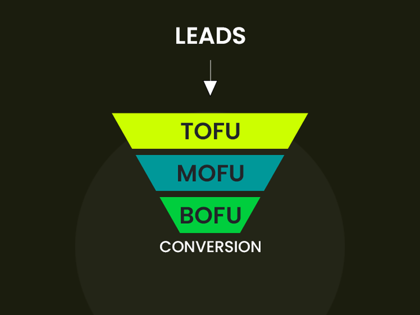
A call to action (CTA) is essentially an invitation that directs visitors to your website to take particular actions. Users are moved closer to conversion by these actions, whether they are at the top-of-the-funnel (TOFU) or bottom-of-the-funnel (BOFU).
However, what exactly is a TOFU action? In the field of marketing, we frequently frame our initiatives inside of a funnel. We see the initial interactions happening at the top of the funnel. Conversions appear near the bottom; these are BOFU actions.
TOFU CTAs encourage users to learn more about what you have to offer. Even though a CTA might not convert a user right away when they fill out a contact form, the TOFU action moves them closer to the middle of the funnel, where they learn more about your brand and eventually make their way to the bottom, where they become loyal, paying customers.
Here are some examples of TOFU CTAs:
-
Give me more information!
-
Sign me up!
-
Download our free ebook!
-
Do you love our products? Click here to learn more!
-
Get your free guide!
Conversely, BOFU CTAs are designed to compel users to commit to a purchase or become a client. These CTAs have a unique way of presenting themselves.
Here are a few instances:
-
Buy now!
-
Submit my payment
-
I’m ready to be a partner!
If your website doesn’t have any compelling call to action (CTAs), it will be harder to draw in your best clients and lower the chance that they will convert.
What then makes CTAs so important?
As stated earlier, the probability of a user converting to a paying customer is minimal if they do not interact with a call to action (CTA).
CTAs give useful information about the interests of the user. A user’s interest in learning more about your business is demonstrated, for example, when they click on a call to action (CTA) asking for their email address to be added to a list for future communications.
In the same way, they will probably find themselves nearer the bottom of the marketing funnel than you first thought if they click on a CTA button in your advertisements. Users can be identified based on where they are in the marketing funnel and how interested they are in your business by examining which CTAs they click on.
Therefore, it is important that you create CTAs for your website that are both clear and compelling. These calls to action (CTAs) act as channels for obtaining important information about user interest and engagement levels. These kinds of insights stay beyond reach without a strong call to action.
5 ways to write effective calls-to-action
Above all, clicks are the main indicator of a CTA’s effectiveness. Your main goal is to convince visitors to click on the call-to-action (CTA) links on your website.
What techniques, though, can you use to create calls to action that are persuasive?
How can these potential customers be converted into real sales?
Now let’s explore the deeper aspects of CTAs that make them so successful.
1. They get straight to the point
Visitors to your website want a brief summary of what you’re offering when you make something available. Long CTAs are not something they want to deal with. Effective call to action (CTAs) don’t have to be as long as they are concise and clear, but they still need to be clear if you want to prevent visitors from leaving because they are confused.
Indicate the purpose of the CTA and make the button’s wording brief and straightforward.
2. They stand out from the rest of the page
A CTA that is designed to match the background color of the page it is on is likely to be overlooked because it will blend in.
To stand out visually, effective CTAs use colors that contrast with the background of the page. For example, red is a highly noticeable color and is often one of the best options for a call to action.
Findings from different case studies, however, don’t always confirm this idea. Therefore, it’s a good idea to run A/B tests on button colors to see which ones perform best for your website.
Furthermore, orange and green buttons are known for drawing attention and clicks.
3. They’re A/B tested
We briefly discussed the importance of A/B testing in the paragraph above; this is a topic that deserves further research.
Because CTAs are so important to your marketing funnel, A/B testing is very important when it comes to CTA buttons.
You can compare two buttons to see which one gets more clicks by using A/B testing to compare them. Rather than relying solely on intuition, this approach helps you make well-informed decisions about the ideal button design.
An A/B test allows you to assess the following elements:
-
Ideal positioning
-
Best-performing color
-
Perfectly sized
-
Relevant content
-
Compelling button text
4. They show the user what’s in it for them
You might not get the best click-through rates by simply using phrases like “click here,” “download,” or “request” to get users to click.
It is advantageous to state the value proposition to the user in the button text instead. To clearly communicate the advantages of clicking the button, use phrases like “learn more by downloading..” “grow your business by contacting us.” or “get actionable results.”
It’s this feature that sets successful user conversion apart from standard call to action. If users don’t think your offer or service is worth it, they are less likely to buy from you or contact you for more details.
5. They are the right size and are positioned correctly on your page
To maximize the impact of your CTA, size and location are both very important.
When choosing a location, it’s important to take into account the action you’re encouraging and the areas of your content where users are most likely to interact with the button.
For example, it would be best to place the call to action (CTA) after a paragraph that discusses the difficulties in pulling off the perfect winged eyeliner if you’re encouraging users to sign up for a free guide on the subject. If you put it at the bottom of the page, people might miss it.
On the other hand, placing the call to action at the bottom of the page may work better for more generic actions like completing a contact form. After reading your interesting content, visitors might be interested in learning more about your business by completing the form.
The size of your CTAs is also important. CTAs run the risk of being disregarded if they are too small, but it is also possible for them to be too big and confuse users for banners or advertisements.
Need help creating effective calls-to-action?
Want to increase your conversion rates but don’t know how to write compelling calls to action?
If you are having trouble coming up with compelling calls-to-action for your company, WebFX can help! Our team of seasoned marketers is skilled at crafting call-to-actions that yield outcomes.
We make sure your calls to action (CTAs) are effective, responsive on a variety of platforms, and crafted to connect with your target audience. Get in touch with us right now at (+255) 783-957-836 or online!


Add your first comment to this post